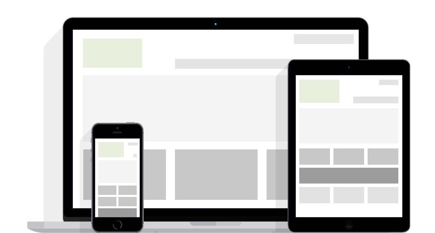
We focused on the arrival of the concept of adaptive web site, since several “framework” is used among millions of websites. This technique involves building the website so that all the columns and rows as fit width and height regardless of the device used.
Indeed, an adaptive website greatly improves playback on smart devices, no need to enlarge the text! Everything is well placed with the equipment used.
Because this technique uses an advanced system of proportion, it creates more optimization and testing before the line so that it is displayed on the thousands of types of mobile devices.
Since we must follow the market and stay competitive, we have decided to offer by default to all our customers an adaptive design to go to reach all mobile users. More and more users are using mobile for their purchases or otherwise, while the desktop is now rather used as part of work or for a sales position with several external components required.
These web design techniques are now focused on the presentation of the mobile site to meet demand, and secondary or specific desktop elements are added. This demonstrates how users are turning to mobile.
Obviously you practical tools to edit and manage your site with ease adaptive web, if you have any problems, please contact us.